
CT & CRI – The two key factors that define the “lighting mood” in interior spaces
In interior design, lighting is more than just a tool that helps us see. It is a “language of emotion” — quietly shaping mood, perception, and the overall quality of human experience in every moment.
Among all lighting specifications, CCT (Correlated Color Temperature) and CRI (Color Rendering Index) are the two core factors that determine whether a space feels warm or cold, authentic or washed out, inviting or dull.
1. Color Temperature (CCT) – The emotional rhythm of light
CCT, short for Correlated Color Temperature, measures the color tone of a light source — whether it appears warm (yellow, amber) or cool (white, blue). It is measured in Kelvin (K), with lower values producing warm light (around 2700K–3000K) and higher values producing cool light (around 4000K–6500K).
Each color temperature feels like a different “emotional state” of light:
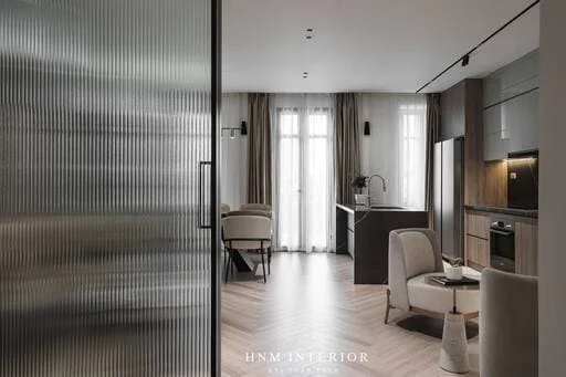
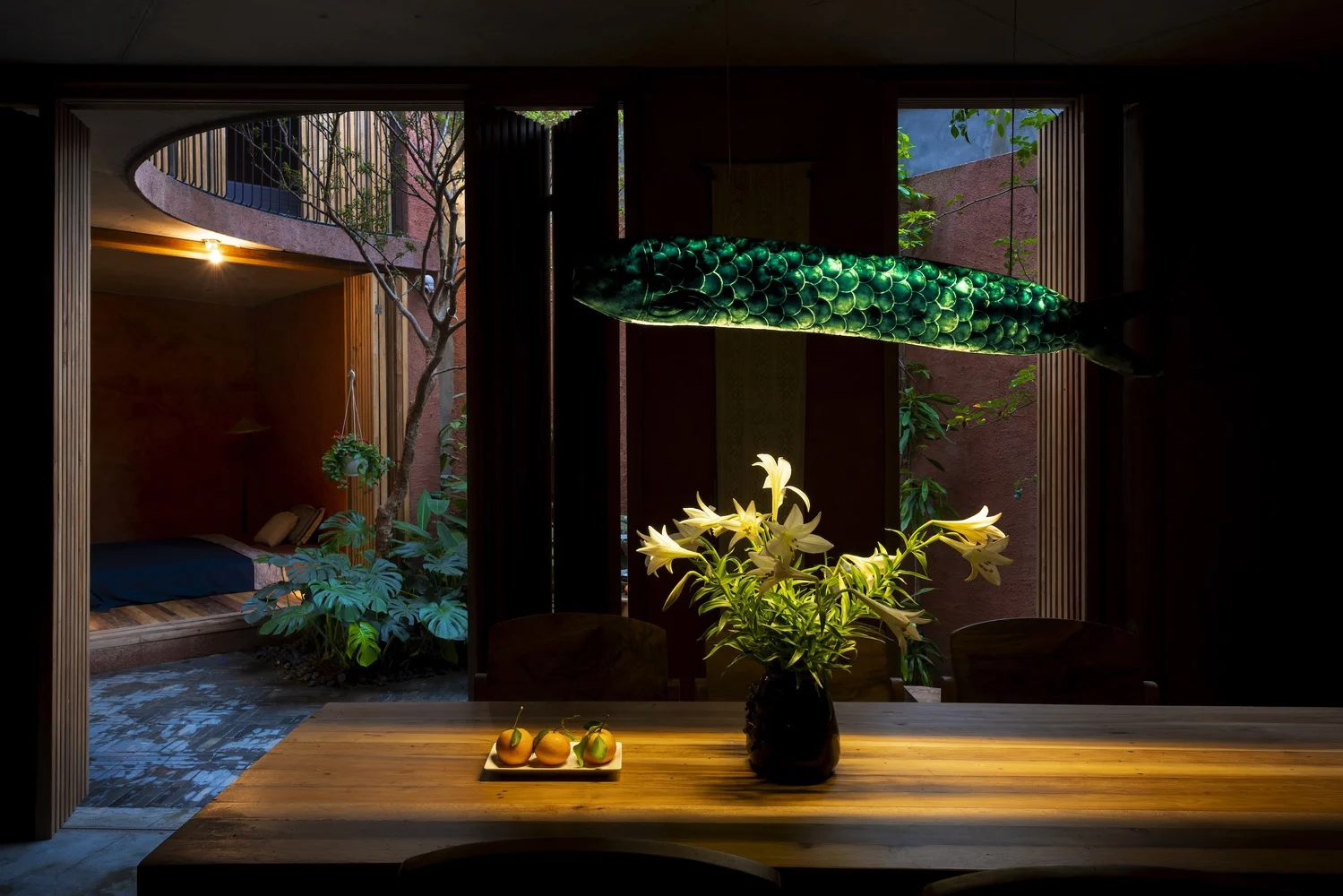
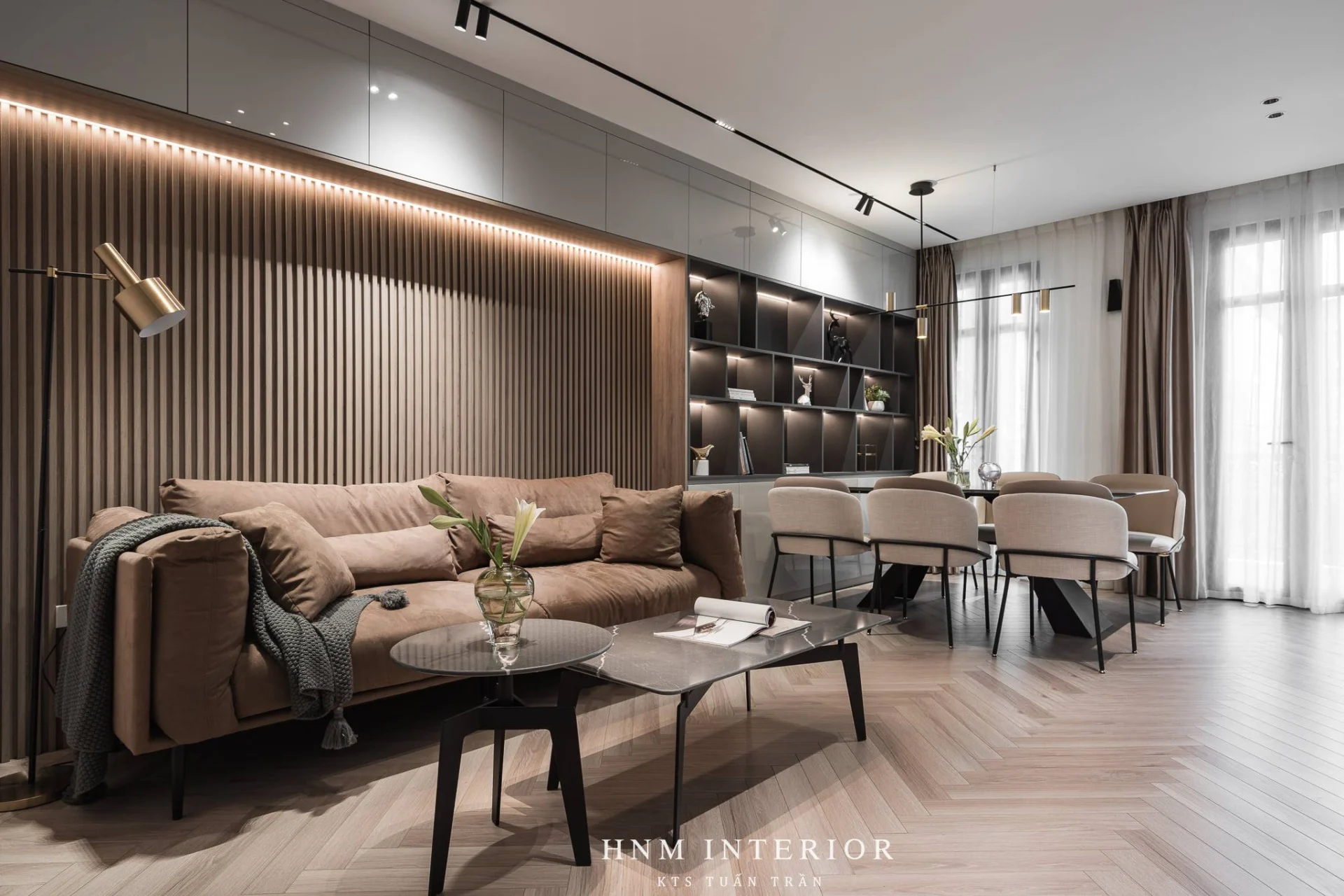
- 2700K–3000K: Warm, soft, gentle light
Creates a relaxing and cozy atmosphere. Ideal for bedrooms and living rooms, making everyday moments more comfortable. - 3500K–4000K: Neutral, balanced light
Offers a moderate level of alertness — modern but not too harsh. Suitable for kitchens, hallways, and home offices. - 5000K+: Cool, crisp light
Enhances focus and clarity. Commonly used in utility areas or spaces requiring high visual accuracy.
Choosing the right CCT allows the space to “breathe” naturally — not only improving appearance but also enhancing comfort, as the lighting supports the experience rather than overwhelming it.
2. Color Rendering Index (CRI) – The truthfulness of beauty
CRI, or Color Rendering Index, measures how accurately a light source reveals the natural colors of objects compared to sunlight (CRI 100). The higher the CRI, the more vivid and realistic the environment appears.
If CCT sets the mood, CRI preserves authenticity:
- People and objects appear in their true colors
- Materials like wood, stone, and fabric show their finest textures
- Artwork and décor become more captivating
- Skin tones look healthy and natural, without dull or grayish hues
- In modern living spaces, CRI ≥ 90 is considered the ideal standard, delivering a noticeably premium visual experience from the moment you walk into the room.
A room can be beautiful — but only with high-CRI lighting does that beauty truly come alive.
| CCT & CRI Recommendations for Each Area of the Home | |||
| Space | CCT (Color Temperature) | CRI (Color Rendering Index) | Notes |
| Living Room | 2700–3000K | ≥ 90 | Creates a warm, comfortable atmosphere; enhances interior colors and skin tones. |
| Bedroom | 2700–3000K | ≥ 90 | Warm, gentle light for relaxation and better sleep. Avoid cool white light. |
| Kitchen | 3000–3500K | ≥ 92–95 | High CRI is essential for clear, accurate visibility of food and kitchen materials. |
| Dining Area | 2700–3000K | ≥ 90 | Warm light makes food look more appealing and enhances a sense of togetherness. |
| Home Office | 3500–4000K | ≥ 90–95 | Neutral CCT supports focus; high CRI is important for working with documents and visuals. |
| Bathroom | 3000–3500K | ≥ 95 | Mirror lighting requires very high CRI for natural skin tone when grooming. |
| Hallway | 2700–3000K | ≥ 80–90 | Soft warm light to maintain harmony with the surrounding spaces. |
| Children’s Room | 2700K (sleeping) / 3500–4000K (studying) | ≥ 90 | Dual lighting modes: warm for relaxation, neutral for effective studying. |
| Utility Areas (laundry, storage) | 4000–5000K | ≥ 80 | Cooler white light for clarity and ease of handling tasks. |
Other News
Những năm gần đây, xu hướng sở hữu nhà ở nghỉ dưỡng tránh xa ồn ào nơi phố thị đang ngày càng được ưa chuộng.
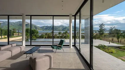
In recent years, the trend of owning vacation homes away from the hustle and bustle of the city has become increasingly popular.
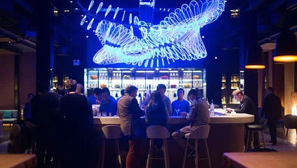
This article shares insights from Mr. Damian de Wind, Project Lighting Director at Mondoluce, about the journey of transforming retail lighting methods in the context of shopping centers adopting a customer-centric approach, focusing on people, their needs, and the overall experience.
Light plays a crucial role in creating engaging environments, enhancing our living experiences.
In recent years, the trend of owning vacation homes away from the hustle and bustle of urban life has become increasingly popular.
In this article, Universal Light is honored to have a conversation with Ms. Fanny Soulard, a lighting designer with extensive experience in the field.
In this article, Universal Light is honored to have a conversation with Ms. Fanny Soulard, a lighting designer with extensive experience in lighting.
In recent years, the trend of owning resort-style homes away from the hustle and bustle of the city has become increasingly popular.
This article shares insights from Mr. Damian de Wind, Project Lighting Director at Mondoluce, about the journey of transforming retail lighting methods in the context of shopping centers adopting a customer-centric approach, focusing on people, their needs, and the overall experience.
Bài viết này trình bày chia sẻ từ ông Damian de Wind, Giám đốc chiếu sáng dự án của Mondoluce, về hành trình chuyển đổi phương pháp chiếu sáng trong bán lẻ giữa bối cảnh các trung tâm mua sắm áp dụng phương pháp chiếu sáng lấy khách hàng làm trung tâm để tập trung vào con người, nhu cầu và trải nghiệm tổng thể.
Light plays an essential role in creating engaging environments, helping us enhance our living experiences.
In recent years, the trend of owning resort-style homes away from the hustle and bustle of the city has become increasingly popular.