


3000K and 4000K Lighting: Which Is Right for Your Space?
3000K and 4000K lighting are two popular color temperature options in interior lighting design. While 3000K generally produces a warm white appearance, 4000K provides a more neutral white light. However, choosing between these two color temperatures is not simply a matter of deciding between yellowish and white light. It also requires careful consideration of functionality, interior finishing materials, and the desired user experience.
In villas, hotels, and commercial buildings, selecting an unsuitable color temperature can make wood, stone, fabric, or painted surfaces appear different from the original design renderings. A guest room intended to feel warm and inviting may appear more neutral than expected. Conversely, an area requiring accurate visual assessment of colors may not achieve the desired effect when the light source is excessively warm.
So, how should architects choose between 3000K and 4000K lighting for hotel bedrooms, corridors, and villa living rooms? This article explores their differences, explains how to evaluate lighting against interior materials, and introduces practical lighting configurations from SVLight to help architects make informed decisions before finalizing their designs.
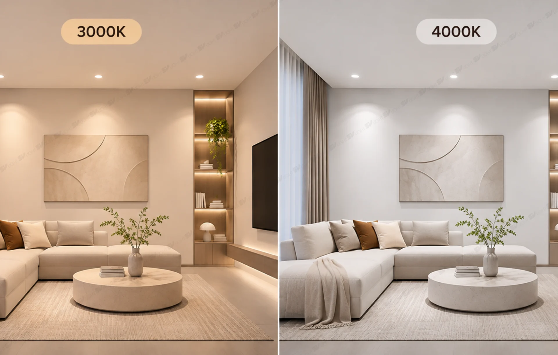
What Is the Difference Between 3000K and 4000K Lighting?
The fundamental difference between 3000K and 4000K lighting lies in the appearance of white light. 3000K is commonly referred to as warm white light, which has a slightly yellowish appearance. In contrast, 4000K produces a more neutral white light with less yellow tint and may create a clearer, more alert atmosphere depending on the surrounding environment.
However, neither color temperature is universally better. Interiors featuring warm-toned wood may benefit from 3000K lighting, while spaces incorporating neutral materials may be suitable for 4000K. The final effect also depends on light quality, illuminance, surface materials, and the overall brightness of the surrounding environment.
| Criteria | 3000K | 4000K |
|---|---|---|
| Light Appearance | Warm white | Neutral white |
| Typical Atmosphere | Warm and relaxing | Neutral and clear |
| Materials to Consider | Warm-toned wood, beige fabrics, and earthy materials | Light-colored stone, neutral materials, and surfaces requiring color assessment |
| Suggested Applications | Guest rooms, reception areas, and relaxation spaces | Functional corridors, workspaces, and multipurpose areas |
| Key Considerations | Material colors, illuminance, and perceived warmth | Glare, visual continuity, and color perception |
The comparison above provides general design guidance rather than mandatory rules. A bedroom can use 4000K lighting when it supports the intended design concept, while a corridor may use 3000K to maintain a consistent experience throughout a hospitality environment.
What Does Downlight Color Temperature Indicate?
Downlight color temperature is typically expressed in Kelvin (K). For white LED lighting, the commonly used specification is correlated color temperature (CCT), which describes the color appearance of light in relation to an ideal reference source.
Lower Kelvin values generally produce warmer-looking light, while higher values tend to create a more neutral or cooler white appearance. Therefore, 3000K typically appears warmer and more yellowish than 4000K, even when two luminaires have the same wattage or luminous flux.
However, two LED light sources labeled 3000K may still produce slightly different color appearances due to their spectral characteristics, chromaticity variations, and manufacturing quality. For projects using multiple luminaires within the same space, color consistency and Standard Deviation of Color Matching (SDCM) specifications should be evaluated during product selection.
Understanding the Difference Between Color Temperature, Brightness, and Color Rendering
A common misconception is that 4000K lighting is always brighter than 3000K. In reality, color temperature is not a measurement of brightness. Luminous flux is expressed in lumens, while illuminance on a surface is generally measured in lux. Lighting performance also depends on beam angle, distance, and luminous intensity distribution.
Similarly, the Color Rendering Index (CRI), also expressed as Ra, indicates how accurately a light source renders object colors compared with a reference illuminant. Two luminaires with the same color temperature but different color rendering performance may cause wood, fabrics, or artwork to appear noticeably different.
For example, choosing 3000K does not automatically guarantee more accurate wood colors. For materials with demanding aesthetic requirements, CRI, spectral quality, and actual material samples should all be evaluated.
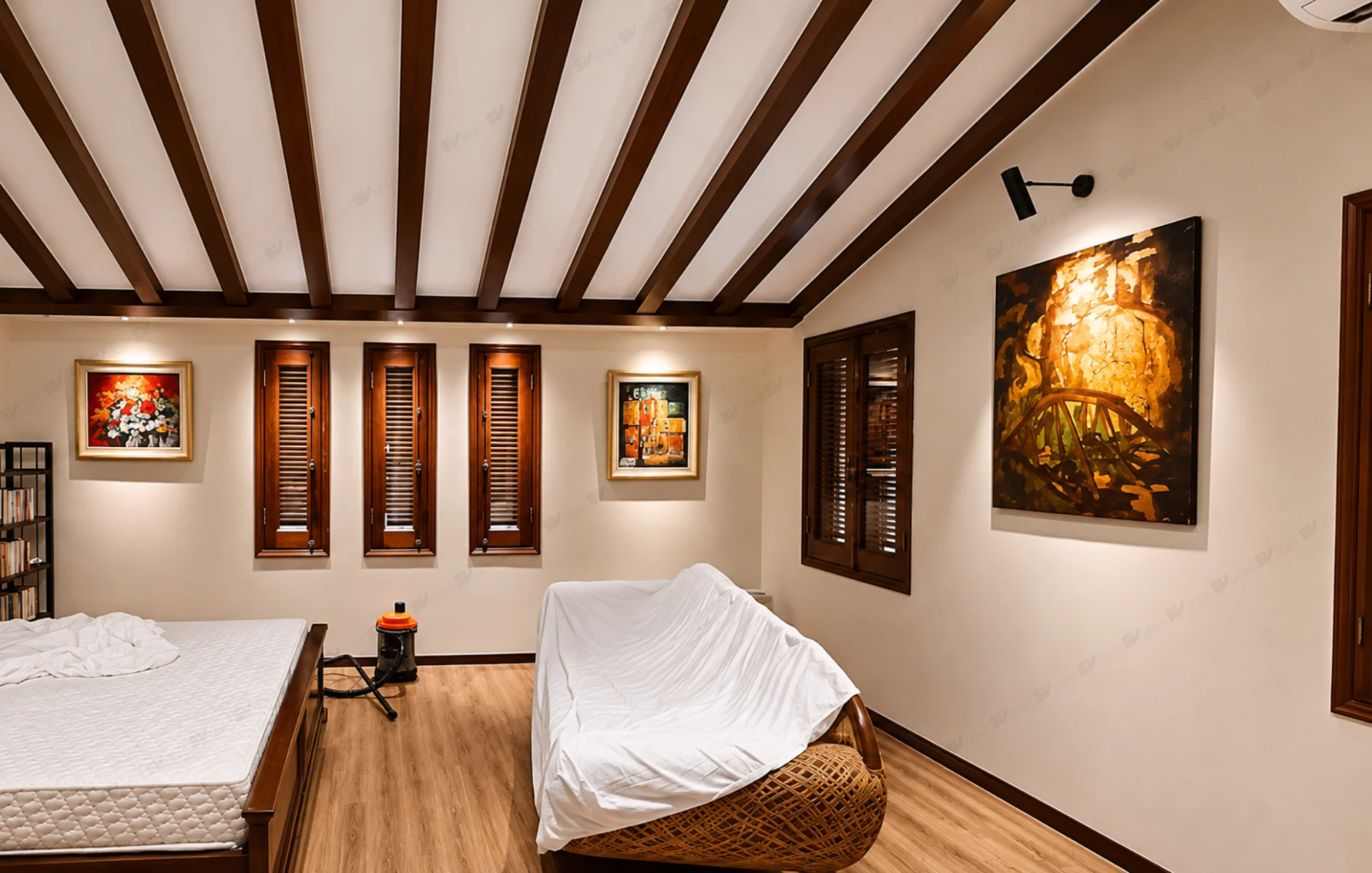
Should You Choose 3000K or 4000K Downlights?
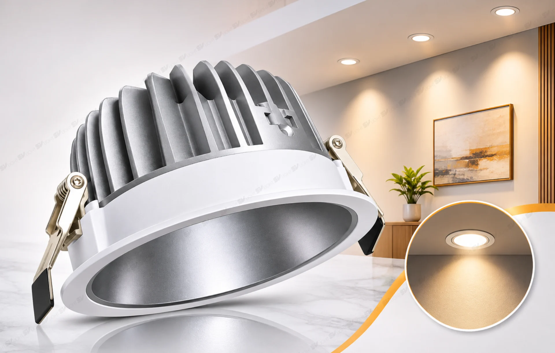
When choosing between 3000K downlights and 4000K downlights, architects should evaluate the role of ambient lighting in each space. Downlights are commonly used for general activities, circulation, and work-related tasks. Therefore, their color temperature should support both functional requirements and the intended architectural atmosphere.
Within the SVLight product range, the SVF-3027 Downlight has a power rating of 10W, a 90° beam angle, a color rendering index above Ra 90, and color temperature options of 2700K, 3000K, 4000K, 5000K, and 6500K. This model can serve as a reference when comparing color temperature options for ambient lighting design. However, the specific product version should be confirmed before finalizing the configuration.
Consider the Function and Time of Use
A single space may accommodate several activities throughout the day. A villa living room can serve as both a reception area and a place for relaxation or family gatherings. Meanwhile, hotel corridors must support safe circulation and wayfinding while maintaining a visual connection with the overall hospitality design.
If the objective is to create a warm atmosphere during the evening, 3000K downlights may be worth testing. For multipurpose areas where clear visibility of materials and a neutral lighting appearance are preferred, 4000K downlights may also be considered.
Color temperature cannot replace proper illuminance design and lighting control. A room illuminated with 3000K lighting may still feel excessively bright or cause glare if the fixtures are poorly arranged. Therefore, usage scenarios, lighting levels, and control strategies should be considered alongside color temperature.
Evaluate Interior Colors and Finishing Materials
Choosing color temperature based on interior materials should begin with the actual material palette. Brown-toned wood, beige fabrics, and warm paint colors may create a comfortable atmosphere under 3000K lighting. However, warm light can also affect how certain gray, white, or neutral surfaces are perceived.
For white stone, gray stone, metal, and surfaces that require relatively neutral color perception, 4000K may be a suitable option for testing. Nevertheless, 4000K should not automatically be considered more color-accurate because color rendering also depends on the light spectrum and the luminaire’s color rendering performance.
For example, a living room featuring light-colored stone flooring, walnut wall panels, and a cream-colored sofa may create two distinctly different impressions under 3000K and 4000K lighting. The final choice should depend on which architectural elements are intended to stand out, the desired appearance of the materials, and the overall harmony of the space.
Coordinate Artificial Lighting with Natural Light and Other Light Sources
Natural light changes in color appearance and intensity depending on the time of day, weather conditions, and window orientation. Therefore, a room equipped with 3000K downlights may feel different in the morning and evening, particularly when daylight contributes significantly to the overall lighting environment.
When combining recessed downlights with pendant lights, wall washers, table lamps, or spotlights, the relationship between different color temperatures should be evaluated. Not every luminaire needs to have the same CCT, but transitions between 3000K and 4000K should serve a clear design purpose.
In interconnected spaces, mixing color temperatures without a deliberate strategy may cause surfaces to appear inconsistent. Separate lighting control groups can be used for ambient and accent lighting, allowing greater flexibility during operation.
Test Lighting on Actual Materials Before Finalizing the Selection
This step is particularly important when clients are concerned that interior materials may appear different from the original design renderings. Rather than comparing 3000K and 4000K solely through images displayed on a screen, sample luminaires should be tested alongside actual finishing materials to evaluate color appearance, contrast, and the overall atmosphere.
One practical method is to position samples of wood, stone, fabric, and paint in conditions similar to their intended installation environment. Test 3000K and 4000K versions in sequence, preferably using the same luminaire series, beam angle, comparable wattage, and controlled illuminance levels to avoid misleading conclusions caused by differences in brightness.
The materials should be observed directly during both daytime and evening conditions, from the positions where occupants will normally view them. When photographs are used for design approval, maintain the same camera angle, exposure, and fixed white balance. Avoid comparing images that have been edited with different color adjustments.
Color Temperature Testing Checklist Before Design Approval
- Prepare actual samples of wood, stone, fabric, paint, and other finishing materials.
- Use 3000K and 4000K sample luminaires from the same product series whenever possible.
- Control illuminance, distance, aiming direction, and ambient lighting conditions.
- Observe the materials directly from key viewing positions and at typical times of use.
- Check CRI, color consistency, and lighting control compatibility.
- Record the luminaire model, color temperature, material specifications, and approved test results.
Testing does not necessarily need to cover the entire project from the beginning. For large-scale developments, a mock-up room or representative area can be selected for evaluation. The results help architects, investors, and contractors establish consistent approval criteria before placing large equipment orders.
Choosing the Right Color Temperature for Different Interior Spaces
When selecting 3000K and 4000K lighting for architectural projects, each area should be evaluated according to its activities, materials, and relationship with adjacent spaces. Hotel bedrooms, corridors, and villa living rooms have different functional requirements, so a single color temperature rule cannot be applied universally.
Choosing Lighting for Hotel Bedrooms
When choosing lighting for hotel bedrooms, the priority is to create a comfortable environment while accommodating different activities, including resting, reading, unpacking luggage, and working at a desk. 3000K may be considered for ambient lighting when the project aims to create a warm and welcoming atmosphere.
However, selecting a single color temperature does not automatically make it suitable for every location. Reading lights must direct sufficient illumination onto the pages while minimizing glare. Desk areas and mirrors may require separate evaluations of illuminance, color rendering, and luminaire placement.
One possible configuration to test is using the SVF-3027 Downlight for part of the ambient lighting layer, combined with dedicated task lighting where necessary. This is only a preliminary configuration suggestion; the number of fixtures and required illuminance should be verified according to the actual room dimensions.
For hotels equipped with lighting control systems, different lighting scenes can be considered for welcoming guests, evening activities, and relaxation. Adjusting lighting levels according to specific scenarios often provides greater flexibility than focusing exclusively on color temperature.
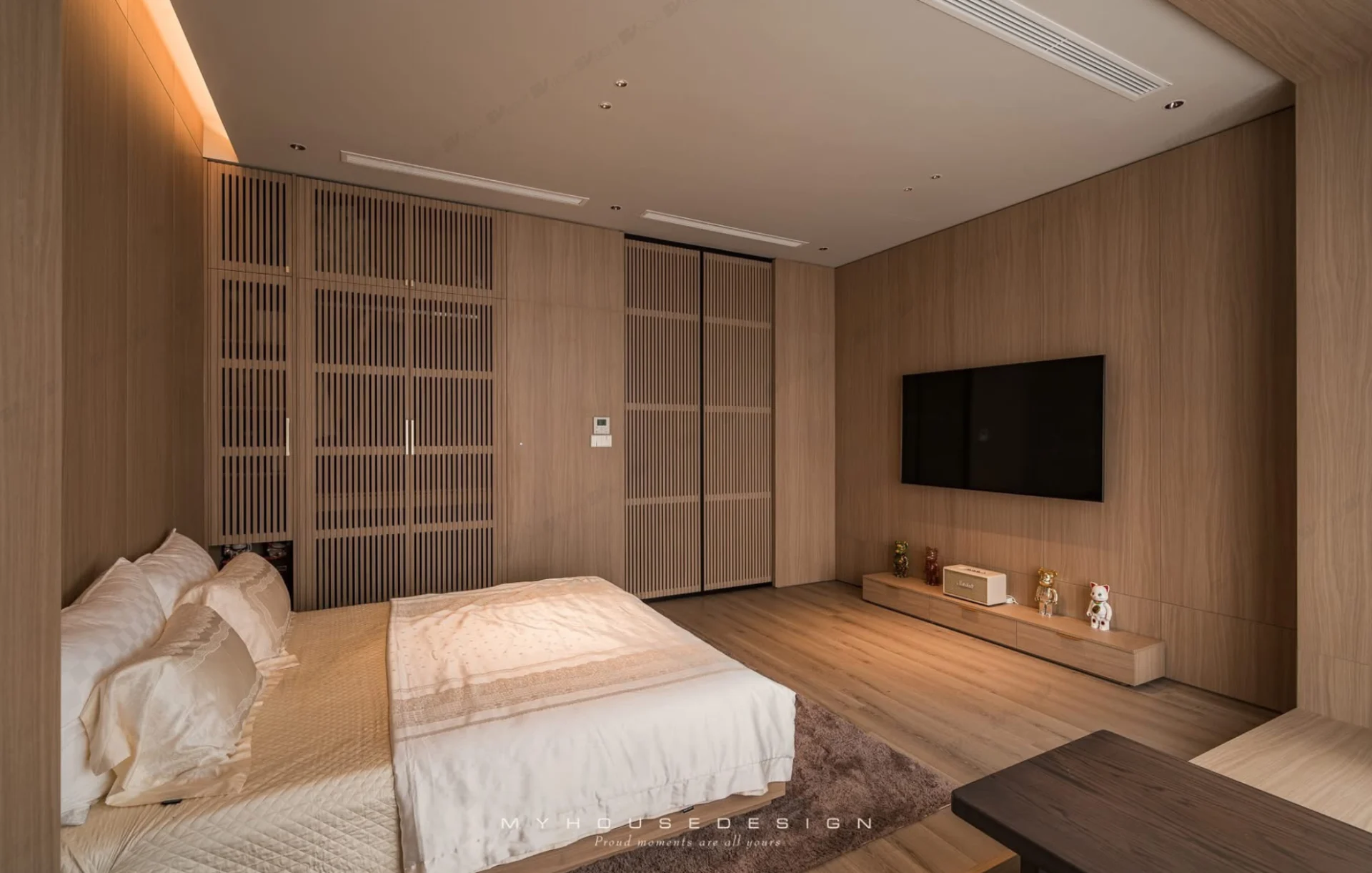
Choosing Lighting for Hotel Corridors
Hotel corridor lighting should support clear visibility of walkways, room numbers, doorways, and transitional areas. In addition to illuminance and uniformity, color temperature influences the sense of visual continuity as guests move from the lobby toward their rooms.
If the entire accommodation area follows a warm, resort-inspired design concept, 3000K lighting may help create a natural transition between corridors and bedrooms. Conversely, 4000K may be considered for functional corridors or architectural areas featuring neutral materials, provided it aligns with the overall design direction.
When developing a lighting coordination strategy for hotel bedrooms and corridors, architects should not evaluate 3000K and 4000K separately. They should also consider transitions through room entrances, visual adaptation between different lighting levels, and materials that continue across both areas.
For long corridors, lighting uniformity, shadows, fixture placement, and continuous operation requirements should also be assessed. An appropriate color temperature cannot compensate for poor lighting layouts or excessive glare.
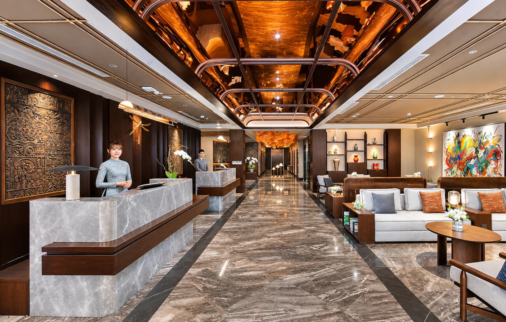
Recessed lighting applications for hotel corridors.
Choosing Lighting for Villa Living Rooms
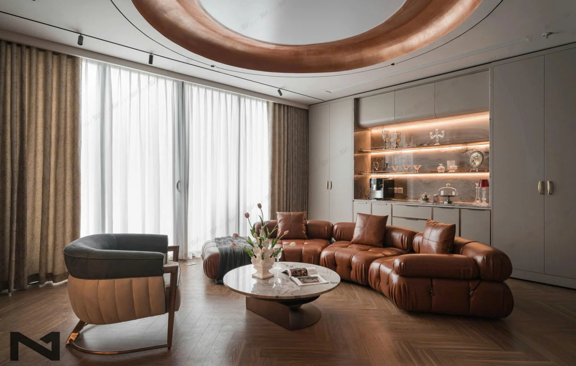
In villa design, living room lighting must support everyday activities while highlighting interior materials and architectural details. Choosing between 3000K and 4000K should depend on the colors of wood, stone, walls, furniture, and the overall interior design style.
For living rooms featuring warm-toned wood, beige sofas, and indirect lighting, 3000K may be a suitable option for testing. If the space incorporates white stone, gray materials, or a modern neutral aesthetic, 4000K may also achieve the intended atmosphere when carefully coordinated with other lighting elements.
To determine whether 3000K or 4000K is better for a villa living room, test both options on the primary materials and evaluate them from the sofa, entrance, and frequently used viewing positions. Particular attention should be paid to reflections from polished stone flooring, glass surfaces, and television screens.
One possible configuration is to use 3000K downlights for ambient lighting and spotlights with the same color temperature to highlight artwork or decorative wall finishes. If 3000K spotlights are combined with 4000K downlights, on-site testing is recommended to control differences in color appearance and avoid unintended inconsistencies.
When Should You Use 3000K Spotlights?
3000K spotlights can be selected when warm accent lighting is desired for artwork, wooden wall panels, decorative objects, or architectural surfaces. However, a 3000K color temperature does not automatically make an object stand out more prominently. The result also depends on aiming direction, beam angle, luminous intensity, and contrast with the ambient lighting layer.
Accent Lighting for Materials and Decorative Objects
3000K spotlights may be suitable for areas where a warm lighting appearance is desired to emphasize material textures, such as artwork, sculptures, wooden walls, or warm-colored stone surfaces. For materials with complex colors, color rendering performance should be evaluated to ensure that the lighting effect aligns with the intended design concept.
Within the SVLight collection, the SVS-1075 Spotlight offers color temperature options of 2700K, 3000K, 4000K, and 5000K, power ratings of 10W or 12W, and a color rendering index of Ra 97. These specifications provide a useful reference when evaluating accent lighting for artwork and interior materials.
For smaller areas such as decorative niches, the SVC-55KF Mini Spotlight may be considered. This product offers 3000K and 4000K options with power ratings of 6W and 9W. Warm Dim and Tunable White configurations are also listed on the website. The exact product version, driver, and control system should be confirmed if adjustable color temperature features are required.
When selecting spotlights for artwork or glossy materials, reflections should be evaluated from the viewer’s perspective. An appropriate color temperature cannot eliminate glare if the luminaire is incorrectly positioned or the light beam is directed toward the observer’s eyes.
Coordinating Spotlights with Ambient Lighting
When combining spotlights with downlights, both color temperature and the function of each lighting group should be considered. A 3000K ambient lighting layer combined with 3000K spotlights may create a consistent color appearance. However, effective accent lighting still requires appropriate luminous intensity, aiming direction, and contrast.
Combining 4000K ambient lighting with 3000K spotlights may be appropriate when architects want to distinguish functional areas from decorative objects. Nevertheless, the combination should be tested on the actual materials to avoid unintended differences in color appearance across the same surface.
For applications requiring adjustable aiming toward artwork or decorative surfaces, the SVS-1275T Spotlight may be considered. This 12W model offers 3000K and 4000K color temperature options. Its 15°, 24°, and 36° beam angles should be selected according to object dimensions and installation distance rather than color temperature alone.
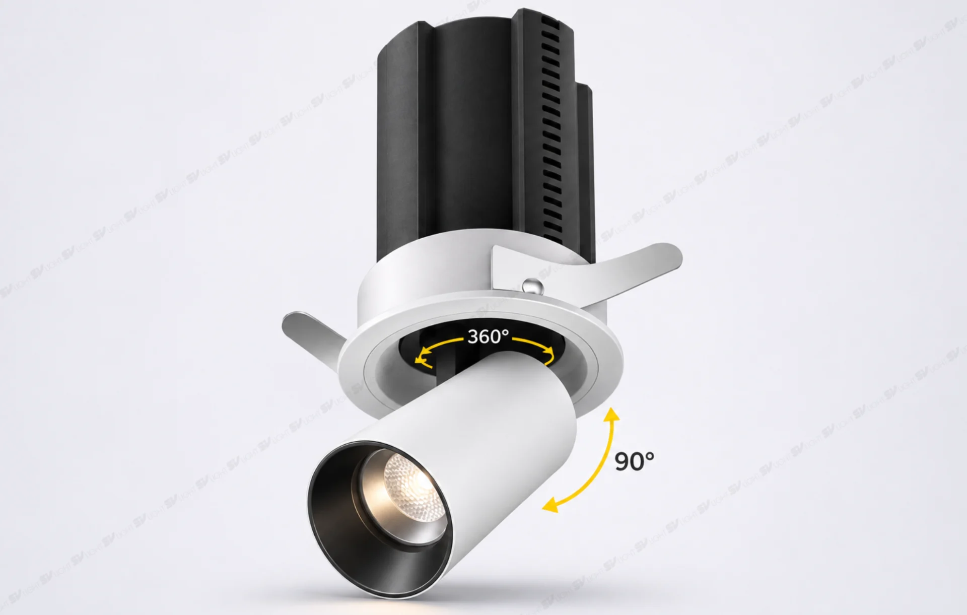
In addition to these models, projects requiring multiple lighting scenes may consider luminaires with adjustable color temperature configurations. However, it is important to distinguish between products offering several fixed CCT options and those that genuinely support CCT adjustment during operation. These capabilities must be verified according to the exact product version and compatible control equipment.
Architect’s Checklist Before Finalizing Color Temperature
- Identify the primary functions and typical times of use.
- Confirm the main interior materials and desired atmosphere.
- Evaluate connected spaces to avoid unintended color temperature transitions.
- Test 3000K and 4000K lighting on actual materials under controlled conditions.
- Check luminous flux, illuminance, CRI, beam angle, and color consistency.
- Document the approved luminaire model, CCT, driver, control system, and product version.
Choosing between 3000K and 4000K lighting should be based on functional requirements and the desired visual experience rather than rigid rules suggesting that bedrooms must always use 3000K or corridors must always use 4000K. Material colors, natural light, illuminance, and the relationship between connected spaces all influence the final lighting design.
For villas and hotels with demanding aesthetic requirements, testing lighting on actual materials before placing equipment orders can reduce the risk of unexpected color appearances. The final configuration should be verified using the exact product model, technical documentation, and actual installation layout.
Get Expert Advice on Color Temperature and Lighting Configurations from SVLight
Architects, interior designers, and project developers can provide floor plans, ceiling heights, material photographs, design renderings, and desired lighting experiences when contacting SVLight for lighting design consultation. For projects requiring precise color control, sample testing should also be discussed before finalizing color temperatures and equipment quantities.
SUNSHINE VIETNAM TRADING JOINT STOCK COMPANY
Branch 1: No. 08, B4 Street, An Khanh Ward, Ho Chi Minh City, Vietnam
Branch 2: No. 116 Truong Chinh Street, Kim Lien Ward, Hanoi, Vietnam
Hotline: 0985 85 86 98
Email: svlight.vn@gmail.com
Website: www.svlight.vn
Facebook 1: SVLight
Facebook 2: SVLight Ho Chi Minh City
Other News
Trimmed and trimless recessed lights are two options commonly considered by architects when designing interior lighting. While trimmed recessed lights create a defined edge where the fixture meets the ceiling, trimless recessed lights provide a seamless, minimalist appearance by reducing visible technical details on the architectural surface. However, choosing between these two types of lighting […]
Interior showroom lighting not only meets the needs of visibility and circulation but also helps highlight the shapes, colors, and materials of individual products. A well-planned lighting system can help customers clearly appreciate sofa upholstery, wood grain, stone surfaces, and important design details. In particular, showrooms frequently change their displayed products according to new collections […]
How to position artwork lighting directly affects how clearly artwork can be viewed and how an interior space is perceived. A beautiful painting can become a focal point in a villa living room, hotel corridor, or exhibition area. However, if the lighting position is unsuitable, it may cast shadows from the frame, create uneven illumination, […]
Color Rendering Index (CRI) is one of the important specifications to consider when selecting LED lighting for interior spaces, especially in areas where accurate color appearance is essential, such as artwork, wooden wall panels, natural stone, fabrics, and displayed products. Even a well-designed interior featuring beautiful materials and a carefully planned lighting layout may fail […]
Spotlight beam angle determines the spread of a light beam and affects the illuminated area on artwork, decorative objects, interior shelves, and display spaces. At the same installation distance, a 15° beam angle can produce a significantly smaller illuminated area than a 36° or 55° beam angle. Therefore, selecting the right spotlight should begin with […]
Downlights and spotlights are widely used in interior lighting, but they typically serve different purposes. Downlights provide a base layer of illumination, while spotlights draw attention to artwork, materials and architectural features. This guide focuses on recessed ceiling fittings: both can sit within the same ceiling design, yet their contribution to the room depends on […]
In interior design, lighting is more than just a tool that helps us see. It is a “language of emotion” — quietly shaping mood, perception, and the overall quality of human experience in every moment. Among all lighting specifications, CCT (Correlated Color Temperature) and CRI (Color Rendering Index) are the two core factors that determine […]

Những năm gần đây, xu hướng sở hữu nhà ở nghỉ dưỡng tránh xa ồn ào nơi phố thị đang ngày càng được ưa chuộng.
In recent years, the trend of owning vacation homes away from the hustle and bustle of the city has become increasingly popular.
This article shares insights from Mr. Damian de Wind, Project Lighting Director at Mondoluce, about the journey of transforming retail lighting methods in the context of shopping centers adopting a customer-centric approach, focusing on people, their needs, and the overall experience.
Light plays a crucial role in creating engaging environments, enhancing our living experiences.
In recent years, the trend of owning vacation homes away from the hustle and bustle of urban life has become increasingly popular.